03-Experiment
A Classic Experiment
The quiz can be viewed at this page.
To run this program as a local web server for development, use npm run
dev. This will serve src/index.html at http://localhost:1234. When this is
running, src/main.js will be imported as a module to the global namespace as
main (only explicitly exported objects will be exposed).
To build this program as a self-contained runnable page, use npm run
build. This will build the project in dist/ and display the specific files
built.
Design choices
We chose our charts based on this paper discussing how we read pie charts.
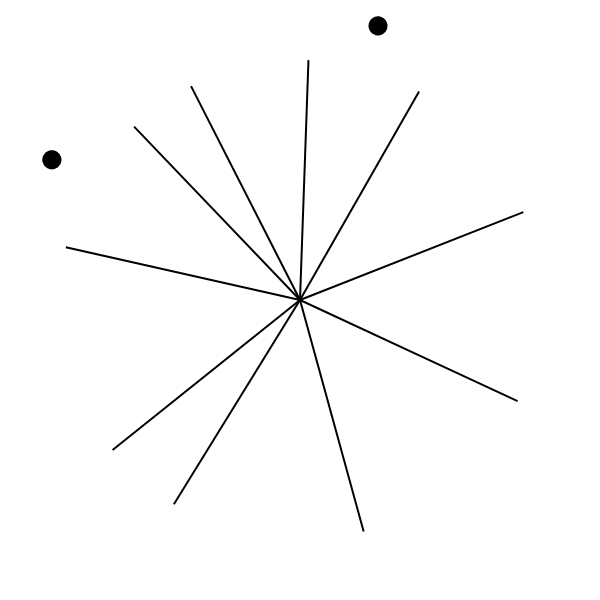
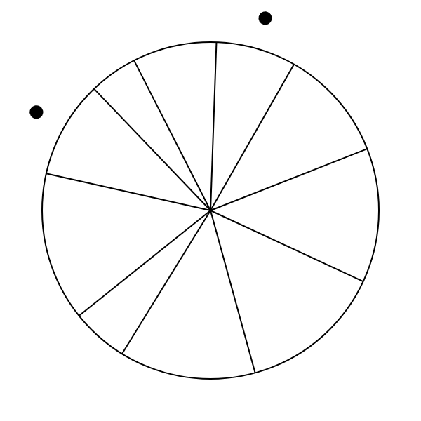
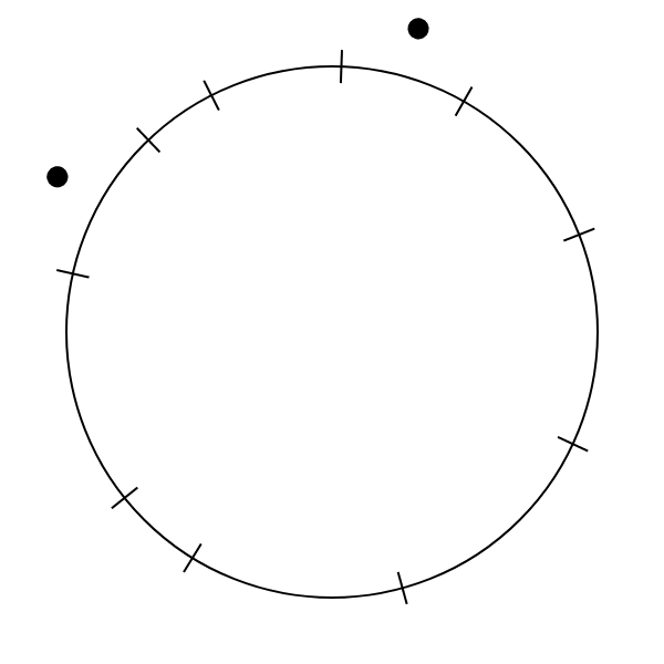
We chose our charts in an attempt to measure how we perceive arc length and angle individually, as opposed to as part of a pie chart. To test perception of angle, we used what we termed a “pure angle” chart—essentially a pie chart without the enclosing circle. To test perception of arclength, we designed an “arc chart”. The arc chart is similar to a pie chart without the internal lines, instead marking the sections with small marks crossing the circle. The three types of charts are shown below.
 |
 |
 |
|---|---|---|
| Pure angle chart | Pie chart | Arc chart |
During testing, we noted that we tended to start to read the pure angle charts as pie charts, partially because we could remember the circle from the pie charts shown previously. To address this, we animated transitions between charts, distracting the user from the charts’ equal sizes.
Design Achievements
We built our dataset based on the methodology of Cleveland and McGill’s paper, with 10 comparison values equally spaced on a log scale (using their formula). To select which pairs of values to compare, we generated random pairs until we had at least one of each possible ratio and the distribution of ratios was fairly even—we generated data until no ratio was present for more than 5 charts of each type, and that most ratios (all but three) were used at least twice.
We also added the constraints from the second experiment in that paper, ensuring that no portion of our chart would be too small (under 3%), too large (over 39%), or too similar to another (within 0.1%). We considered modifying these constraints, but ultimately decided that the data generated with them were sufficient.
We positioned the markers for the values being compared outside the charts to minimize how much they impacted the user’s perception of the charts. We considered placing the markers within the charts, but this made the angle charts more difficult to read.
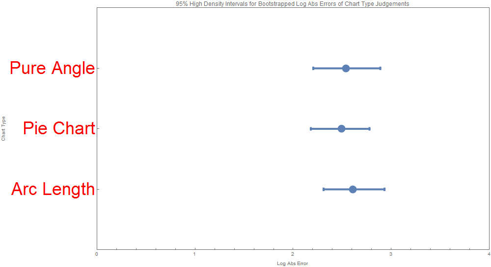
We produced visualizations for the analysis of the data, namely the intervals for the errors (Means of Midmeans of Log Absolute Errors) across the 3 chart types. There were two visualizations of this kind both based on a Bayesian bootstrapping, one for the HDI (high density interval) and one for the credible interval. Admittedly they look quite similar. These intervals are actually asymmetric and are more informational and aesthetically appealing those found in the original Cleveland 84 paper.
| ChartJudgmentType | BootstrapType | LowerBound | UpperBound | IntervalType | Mean | Std | Alpha |
|---|---|---|---|---|---|---|---|
| Arc Length | Bayesian | 2.310027541 | 2.931342368 | HDI | 2.607574078 | 0.161091546 | 0.05 |
| Arc Length | Bayesian | 2.297112522 | 2.930162026 | Credible | 2.607574078 | 0.161091546 | 0.05 |
| Pie Chart | Bayesian | 2.180320806 | 2.777901815 | HDI | 2.494879561 | 0.156881828 | 0.05 |
| Pie Chart | Bayesian | 2.185232049 | 2.790922092 | Credible | 2.494879561 | 0.156881828 | 0.05 |
| Pure Angle | Bayesian | 2.204783025 | 2.888411077 | HDI | 2.53568371 | 0.172598983 | 0.05 |
| Pure Angle | Bayesian | 2.205887434 | 2.890002811 | Credible | 2.53568371 | 0.172598983 | 0.05 |
 |
 |
|---|---|
| HDI | Credible Interval |
Note that error is slightly higher for the non-pie charts—people read pie charts more accurately than the other two types of chart. This may be because of familiarity with the format, but it may also be because the combination of visual channels makes the data easier to read quickly.
Accuracy was slightly higher for the “pure angle” charts than the arc length charts, but we are uncertain that this accurately represents actual perception of the intended visual channels. While the arc length chart is hard to read through any other channel, the pure angle chart could be read using channels besides angle, such as the distance between the charts’ arms, which we noticed when taking the tests ourselves.
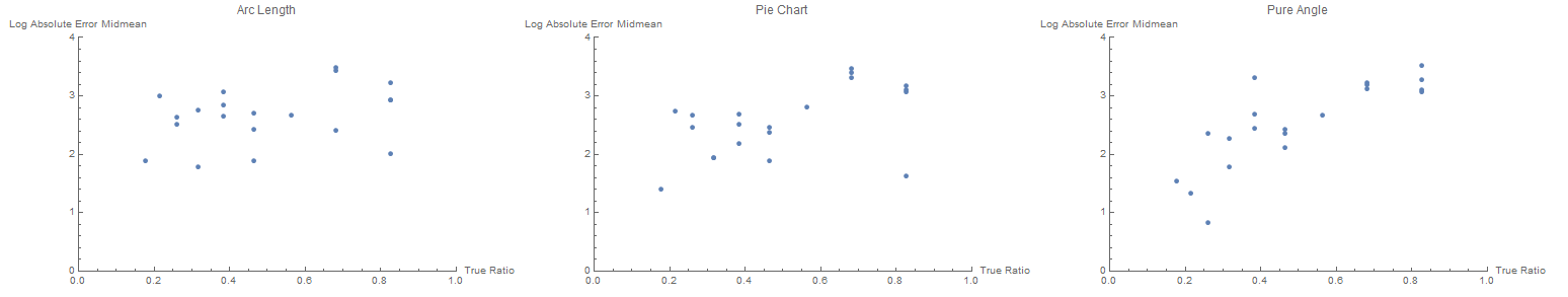
We’ve also visualized the errors vs the true ratios for each chart type
to determine if some ratios are more easily judged than others.
Technical Achievements
The analysis of the data involved producing intervals for the errors (Means of Midmeans of Log Absolute Errors) across the 3 chart types. To do this, Bayesian Bootstrapping was implemented with 1000 repetitions. This includes defining the resampling procedure as follows:
-
Resample user judgments from every chart judgment instance (chart type + dataset) of the same size as the original sample via a Bayesian mechanism. This a two-leveled mechanism meaning resamples are performed with randomized weights. Each resampled element is a random choice over the existing samples with choice weights that are determined every element via a random sample from the Dirichlet distribution with all parameters=1. Classical (non-Bayesian) bootstrapped resamples could be derived through an equivalent process where instead of drawing the weights from a Dirichlet distribution, the weights would always be equal to 1/n.
-
Calculate that Log Absolute Error for every judgment
-
Truncate the errors of resampled judgments for every chart judgment instance to only contain the IQR (25-75th percentile).
-
Perform an average across the data sets of the errors of resampled judgments for every chart type and every bootstrap repetition.
-
Find the intervals of the errors for each chart type as desired, using the bootstrap repetitions. HDI and Credible intervals were used and visualized.
All the data in the app and experiment is stored in a local SQLite database. Although the webapp does not establish a connection with this database via a server, this database allows persistence of all user results, and analysis outcomes, and intermediary analysis steps. This database is connected to by both Python scripts performing data analysis and a Mathematica notebook that generates visualizations for the analysis.
To allow more direct comparison between results, the same 20 sets of data are used for each of the three chart types.